Dynamics 365 is a suite of business applications provided by Microsoft that helps an organization manage their customer relationship management (CRM) and enterprise resource planning (ERP) processes. The Dynamics 365 logo is an important visual representation of the brand and is used in various contexts, including on the Dynamics 365 website, in marketing materials, and in product packaging. In this article, we will delve into the history of the Dynamics 365 logo and discuss best practices for using the logo in various contexts.

NOTE:
Everything covered in this article is currently supported by both the standalone Dynamics 365 for HR and the unified Finance platform. During maintenance, the navigation may behave differently than described. Use search to locate any content on the site.
This post details the actions that can be taken by system administrators to change the flyer or logo image that represents a company or organization. USMF provided the demo data for this process development.
- The first step is to select Modules > Organisation Management > Organisations > Legal Entities from the navigation pane.
- Choose the company or organization on the left from the drop-down menu to edit its banner or logo. Proceed to the next step if it has already been selected.
- Third, the picture tab on the dashboard can be expanded.
- The fourth step is to pick the option that says “Change.”
- To get the most out of your banner, you should shoot for 1920 pixels wide by 281 pixels tall.
- At 350 pixels in width, a logo is just right.
- Choose to save.
- The default dashboard can be found in the navigation pane under Module > Common > Common. A new flag or logo should now be shown on the control panel.
If you uploaded a banner for a certain company, you may need to switch to that company using the company selector.
Creating NAVBAR logo:
How to make that Windows Navbar Logo exactly right for your Microsoft Dynamics or Power Platform app Today I’ll go over some tips for ensuring that your logo’s dimensions are spot-on, and I’ll also share the Photoshop PSD file I used for this article so that you may use it as a starting point for your own designs.
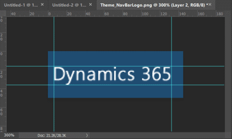
Let’s start off with the logo that’s pre-installed in the latest version of Dynamics 365 (April 2019).
Specifics of a Symbol Used by a Traditionally-Styled User
| Resource Name | Theme_NavBarLogo.png |
| Location | /_static/oobwebresource/Theme_NavBarLogo.png |
| Dimensions | 145 pixels x 50 pixels |
| Resolution | 72 DPI |
| Image |  |
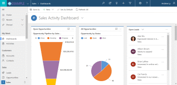
| How it looks in Dynamics |  |
| Default Margins | 
LEFT: 7px TOP: 17px BOTTOM: 14px RIGHT: 13px |
You’ll see that the left and right margins and the top and bottom margins aren’t perfectly aligned with each other. This was done on purpose to adjust the line height of the Dynamics logo to better fit the letter “y.” In the context of this practice of creating a new logo template, this is not really relevant. The following settings, with some minor margin corrections, should provide us with the appropriate proportions and margins for our new logo.
SIZE (WIDTH): 145px (same)
SIZE (inches): 50px HIGH (same)
A 10px left margin is required (from the default 7px).
TOP MARGIN: 15px (down from 17px by default)
Bottom margin 15px (up from 14px by default)
RIGHT SIDE MARGIN: 10px (down from 13px by default)
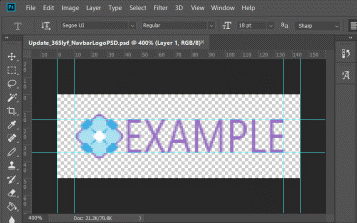
We can use this as a starting point for future work. I made this in Photoshop, but the same adjustments would work in GIMP or any other image editor.
PSD template details:
Details
| Resource Name | Update_365lyf_NavbarLogoPSD.psd (Adobe Photoshop file) |
| Location | download link |
| Dimensions | 145 pixels x 50 pixels |
| Resolution | 72 DPI |
| Image |  |
| How it Looks in Dynamics |  |
| Updated Margins (Recommended for Custom Navbar Logos) | 
LEFT: 10px (from default 7px) |
Irrelevantly, the new unified design, instead of using a PNG logo image, uses a SPAN component with a Segue UI font stating “Dynamics 365” in 1.43 em font size. On the other hand, if you intend to brand your gateway with a unique logo, this is completely unnecessary.
In addition, if you want your Dynamics 365 logo to be as crisp as possible, you can upload a Scalable Vector Graphic (SVG). But you’ll need a vector-based logo, which might be hard to make in Adobe Illustrator from a raster zed image file.
So perhaps it was a helpful bit of information for you. Comment below if there is any other advice you’d like to see posted here.


